Detailed study of the four contributions to

At this point it is time to release the limiting assumption
of exact values of sensitivity and specificity, i.e.
 .
Moreover, having checked that the approximated formulae
can take into account with great accuracy also the
contribution due to the uncertain value of
.
Moreover, having checked that the approximated formulae
can take into account with great accuracy also the
contribution due to the uncertain value of  ,
we find it interesting and useful to study
the individual contributions to the uncertainty
with which we can forecast the fraction
,
we find it interesting and useful to study
the individual contributions to the uncertainty
with which we can forecast the fraction  of tested individuals
resulting positive. For the reader's
convenience, we summarize here the relevant,
approximated expressions, making also use,
in order to simplify them, of the equality
E
of tested individuals
resulting positive. For the reader's
convenience, we summarize here the relevant,
approximated expressions, making also use,
in order to simplify them, of the equality
E :
:
E |
 |
E E E |
(69) |
 |
|
 |
(70) |
 |
 |
 |
(71) |
 |
|
 |
(72) |
 |
|
 |
(73) |
 |
|
 E E E E |
|
| |
|
 E E E E |
(74) |
We can note that
 and
and
 are independent of the sample size
  ,
while
,
while
 and
and
 exhibit the typical `statistical dependence'
 .
Therefore we shall refer hereafter to
and
as random (or statistical) contributions;
to the others
as contributions due to systematics,
which cannot be improved increasing the sample size.
.
Therefore we shall refer hereafter to
and
as random (or statistical) contributions;
to the others
as contributions due to systematics,
which cannot be improved increasing the sample size.
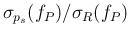
The upper plot of Fig. ![[*]](crossref.png)
Figure:
Contributions to the relative uncertainty
on the fraction of positives as a function of the sample size ,
assuming it much smaller than the population size  , for a proportion
of infected individuals
, for a proportion
of infected individuals
 .
The solid blue line with negative slope is the contribution
from
, the dashed blue one is the contribution
from
, the dotted line is the
`quadratic sum' of the two; the lower horizontal red one
is the contribution from
and the
upper horizontal one is the contribution from
(a dotted red line,
showing their `quadratic sum' is
indeed overlapping the
.
The solid blue line with negative slope is the contribution
from
, the dashed blue one is the contribution
from
, the dotted line is the
`quadratic sum' of the two; the lower horizontal red one
is the contribution from
and the
upper horizontal one is the contribution from
(a dotted red line,
showing their `quadratic sum' is
indeed overlapping the  contribution).
The overall uncertainty is shown by the
uppest curve (dotted brown). The upper plot is for
a standard uncertainty on
contribution).
The overall uncertainty is shown by the
uppest curve (dotted brown). The upper plot is for
a standard uncertainty on
 .
The lower plot is for the case of uncertainty reduced to
.
The lower plot is for the case of uncertainty reduced to
 .
.
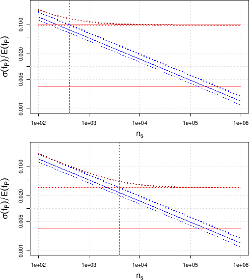 |
shows,
for our reference value of and for uncertain  and
(summarized as
and
(summarized as
 and
and
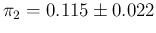 ),
the relative uncertainty on
),
the relative uncertainty on  ,
that is
,
that is
 E
E , as a function of ,
highlighting the different contributions to the total uncertainty.
The horizontal lines represent the two systematic contributions,
independent from , while their quadratic sum does not
appears in the plot, because it overlaps practically exactly
with the dominant systematic contribution, due to the uncertain .
The `straight lines with negative slopes'
(in log-log plot, which notoriously
linearizes power laws) are the individual
statistical contributions (solid and dashed, respectively -
see the figure caption for details) and their quadratic sum
(dotted). The uppest (dotted brown) curve is the overall uncertainty,
dominated at small by the statistical contributions
and at high by the systematic ones,
namely by
. (We shall come in a while
into the meaning and the importance
of the vertical line.)
, as a function of ,
highlighting the different contributions to the total uncertainty.
The horizontal lines represent the two systematic contributions,
independent from , while their quadratic sum does not
appears in the plot, because it overlaps practically exactly
with the dominant systematic contribution, due to the uncertain .
The `straight lines with negative slopes'
(in log-log plot, which notoriously
linearizes power laws) are the individual
statistical contributions (solid and dashed, respectively -
see the figure caption for details) and their quadratic sum
(dotted). The uppest (dotted brown) curve is the overall uncertainty,
dominated at small by the statistical contributions
and at high by the systematic ones,
namely by
. (We shall come in a while
into the meaning and the importance
of the vertical line.)
Since the dominant contribution due to
 limits the relative uncertainty on to about
  , reached
for above a few thousands,
it is interesting to see what we would gain reducing
to the value of
, reached
for above a few thousands,
it is interesting to see what we would gain reducing
to the value of
 . This is done in the bottom plot
of Fig. , which shows a
clear improvement, although the contribution
due to
still dominates with respect to that due
to
,
because the former enters, for , with a weight 9 times higher
than the latter,
as it results from Eqs. () and ().
Moreover, since all contributions to the uncertainty on depend also
on
. This is done in the bottom plot
of Fig. , which shows a
clear improvement, although the contribution
due to
still dominates with respect to that due
to
,
because the former enters, for , with a weight 9 times higher
than the latter,
as it results from Eqs. () and ().
Moreover, since all contributions to the uncertainty on depend also
on  ,
we report in Fig.
the case of a supposed proportion of
infectees37as high as
,
we report in Fig.
the case of a supposed proportion of
infectees37as high as  (i.e.
(i.e.  ).
).
Figure:
Same as Fig.
for a proportion of infected individuals of (
).
In this case the contribution from sampling the population
is larger than that from
. Note that
in the lower plot the two solid horizontal lines collapse into a single one,
being the contribution from
and
equal. It is, instead, visible, with respect to the plots of
Fig. the horizontal
dotted line showing the quadratic combination of the systematic
contributions, reached asymptotically by the
top dotted curve representing the global relative uncertainty on .
 |
One of the remarkable difference with respect to
Fig. is that
the contribution from
becomes
larger than that from
(remaining
always `parallel' as a function of in `log-log' plots,
since they depend on the same power of the sample size).
Indeed,
starts dominating from
 up to
up to
 , as shown in Fig. ,
Figure:
Ratio of
to
as a function of the population
fraction of infected .
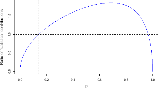 |
in which the
ratio
 as a function of , is reported,
exhibiting a whale-like shape.
as a function of , is reported,
exhibiting a whale-like shape.
As a further example we show in
Fig. the contributions
Figure:
Same quantities of
Figs.
and ,
but in the symmetric case of specificity equal to sensitivity,
i.e.
E E
E ,
again with equal uncertainties,
i.e.
.
The upper plot, for
, has to be compared to the lower plot
of Fig. ; the lower plot,
for
, has to be compared to the lower plot of
Fig. .
,
again with equal uncertainties,
i.e.
.
The upper plot, for
, has to be compared to the lower plot
of Fig. ; the lower plot,
for
, has to be compared to the lower plot of
Fig. .
 |
to the relative uncertainty of for the case of
improved specificity of the test, i.e. reducing the expected value
of from 0.115 to 0.022, keeping its uncertainty
equal to that of , that is 0.007. This means that we consider
specificity equal to sensitivity, both in expected value and in uncertainty.
In practice this is done swapping the parameters of the
related Beta distributions, that is
 and
and  (see Sec. ).
In order to make evident the differences with what has been shown
in the previous cases,
we plot
 E
E for both (upper plot)
and (lower plot). In particular, in order to see
the effect of this last improvement of the specificity
(i.e. increasing its expected value from 0.885 to 0.978,
keeping the same standard uncertainty)
we need to compare the upper plot of
Fig.
with the lower plot
of Fig. ;
the lower plot of Fig.
with the lower plot of
Fig. .
The result is, at least at a first sight, quite counter-intuitive,
since to a sizable improvement in specificity
there is a reduction in the relative accuracy with which
the fraction of positives is expected (effect particularly
important for ). We shall comment about it in the
next sub-section, in which we start
describing the vertical
lines in the plots of Figs. ,
and
, commenting on their importance.
for both (upper plot)
and (lower plot). In particular, in order to see
the effect of this last improvement of the specificity
(i.e. increasing its expected value from 0.885 to 0.978,
keeping the same standard uncertainty)
we need to compare the upper plot of
Fig.
with the lower plot
of Fig. ;
the lower plot of Fig.
with the lower plot of
Fig. .
The result is, at least at a first sight, quite counter-intuitive,
since to a sizable improvement in specificity
there is a reduction in the relative accuracy with which
the fraction of positives is expected (effect particularly
important for ). We shall comment about it in the
next sub-section, in which we start
describing the vertical
lines in the plots of Figs. ,
and
, commenting on their importance.