Next: Dependence on our knowledge Up: Inferring from the observed Previous: From the general problem Contents
![[*]](crossref.png) the role of such
at a first glance an insane prior (see also Sec. ).
the role of such
at a first glance an insane prior (see also Sec. ).
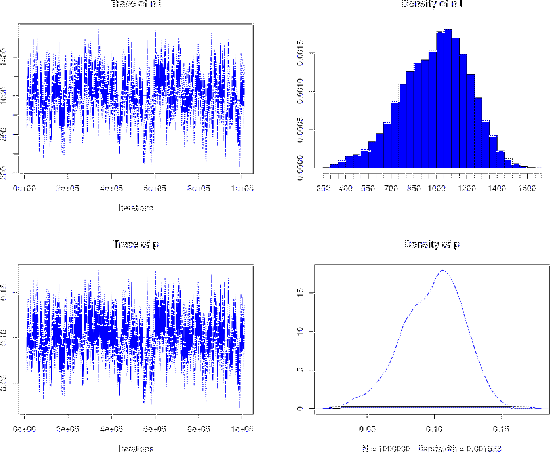
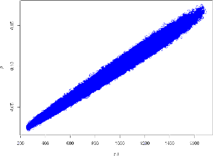
These are the R command to set the parameters of the game, call JAGS and show some results (for the complete script see Appendix B.10).
#---- data and parameters
nr = 1000000
ns = 10000
nP = 2010
r0 = s0 = 1
r1 = 409.1; s1 = 9.1
r2 = 25.2;  s2 = 193.1

# define the model and load rjags (omitted)
# .........................................

#---- call JAGS ---------
data <- list(ns=ns, nP=nP, r0=s0, s0=s0, r1=r1, s1=s1, r2=r2, s2=s2)
jm <- jags.model(model, data)
update(jm, 10000)
to.monitor <-  c('p', 'n.I')
chain <- coda.samples(jm, to.monitor, n.iter=nr)

#---- show results
print(summary(chain))
plot(chain, col='blue')
1. Empirical mean and standard deviation for each variable,
   plus standard error of the mean:

         Mean        SD  Naive SE Time-series SE
n.I 991.12477 225.85901 2.259e-01      16.079460
p     0.09919   0.02278 2.278e-05       0.001601

2. Quantiles for each variable:

         2.5%       25%      50%       75%     97.5%
n.I 506.00000 838.00000 1012.000 1153.0000 1389.0000
p     0.05046   0.08372    0.101    0.1155    0.1396
,
together with the `traces', i.e.
the values of the sampled variables during the
and quantified
by